There's a website called PostSecrect--some of you may have heard of it. Pretty much it's a website of ongoing community art project where people mail in their secrects annoymously on one side of a postcard. The following link was one of the post cards sent in this week and deals with the topic of last week. Just wanted to share it with you all.
Monday, February 28, 2011
PostSecrect.com
Wednesday, February 23, 2011
Learning Module 6


Due Saturday (2/26) by noon
After reading the essay, “And So I Choose,” by Allison Crews place her discussion of “rights” in conversation with the article you read for class this week, “Beyond Pro-Choice vs. Pro-Life?” First (2 paragraphs), in your own words, please describe why each of these terms are in fact problematic or limiting to our larger discussion of reproductive rights. Why were each limiting in Crew’s reflection? What does a “reproductive justice” paradigm offer instead? Second (1-2 paragraphs) reflect on the recent arguments surrounding legislation addressed to congress (see links below). What do you think is at stake in politicizing women’s bodies and reproduction? What would a reproductive justice argument look like in response to this legislation?
http://www.huffingtonpost.com/2011/02/18/planned-parenthood-fundin_n_825258.html?ref=fb&src=sp
http://reproductiverights.org/sites/crr.civicactions.net/files/documents/Center%20for%20Reproductive%20Rights%20Testimony%202%2014%2011.pdf
Learning Module 5 (Redo)


Imagine you are participating in a conversation with the Combahee River Collective and, in a consciousness-raising group, you read the following article. Using the Combahee River Collective Statement and what you have learned in the past weeks, discuss a black feminist perspective to this issue (In 2-3 paragraphs). How would the Collective approach the issue, especially with regard to privilege, interlocking oppressions, “the personal is political”, and a critique of the limitations of dominant feminist and anti-racist approaches to hierarchies of inequality. What new perspectives might they offer? Be creative…imagine you are sitting at the table with them!
http://www.theroot.com/views/recy-taylor-symbol-jim-crow-s-forgotten-horror
Saturday, February 19, 2011
Learning Module 5
LEARNING MODULE FIVE
(due Saturday by noon)
Imagine bell hooks joins the Combahee River Collective and in a consciousness-raising group reads her article “Straightening Our Hair”, and shows the film clip “A Girl Like Me”. Based upon your readings for this week, discuss a black feminist perspective to this topic. How would the Collective approach the issue, especially with regard to privilege, interlocking oppressions, “the personal is political”, and a critique of the limitations of dominant feminist and anti-racist approaches to hierarchies of inequality. What new perspectives might they offer? Be creative…imagine you are sitting at the table with them!
http://www.understandingrace.org/lived/video/index.html
Wednesday, February 9, 2011
LEARNING MODULE 4
(Due Saturday by NOON)

1) Choose three examples from either the White Privilege Checklist, the Male Privilege Checklist, and the Black Male Privilege Checklist, or the Heterosexual Checklist (Katz) that made you think about your own privilege in a new way and tell us why (1 paragraph)
2) Now make your own checklist (5 items) and explain why these are privileges using the week’s readings and lecture. Explain key facets of the systems of oppression (gender, racial, heterosexist) that exist to reinforce these privileges in your life (2 paragraphs).
3) Go to your section’s wallwisher link for “Gender Microaggressions” (on E-learning). Post an example of a gender microaggression. Then post the message that this microaggression sends (this is a required posting and will count toward full credit for this learning module!)
"The dominant group is damaged even as it receives huge benefits. You pay for the privilege and the cost is enormous.”~Tim Wise

Sunday, February 6, 2011
Part 1:
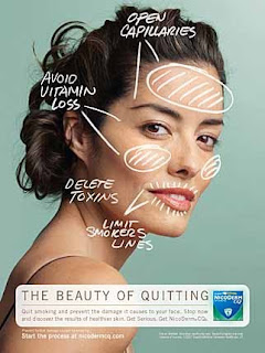
The first picture is an advertisement for Nicoderm CQ. Most advertisements for nicotine gum or patches all tend to have the same "Quitting is tough, but cancer is worse" message, but this one is geared specifically towards women. The message is now more like "Quit smoking or you'll lose your looks." The ad even says "The Beauty of Quitting," and displays a picture of a lovely woman (thin, light-skinned, and conventionally pretty) who we can assume has taken steps to "prevent the damage" smoking might inflict upon her otherwise flawless face by using this product.
There's no message about health; apparently now the number-one danger associated with smoking is not stroke, emphysema, or cancer, but ugliness. This ad presumes to know what women care about, and it is not having a healthy body. According to this ad, the only health benefits that a woman who quits smoking has to care about are the ones that show on the outside, the ones that make her prettier. She must aim not for healthier lungs, but healthier skin. She should care about her true assets (i.e. her looks) because long-lasting beauty is a much worthier goal than long-lasting health, right?

The next ad is almost entirely comprised of text, but the message is just as warped as the one in the previous picture. This is obviously an ad for a jewelry store, but it is not aimed at women. The ad assumes that men will be buying the jewelry, that they have both the money and the authority to buy diamonds. What goes unsaid is that a woman won't be buying jewelry for herself, that buying jewelry is what a man does to bribe or cajole a woman into a certain mood. Buy a girl a diamond bracelet and she'll be all smiles, right? It doesn't matter if you backed over her cat, just bring home something shiny and all will be forgiven. This implies that women are shallow and easily swayed by material goods. The tone of the ad is sarcastic; the implied "Because we all know how women can be, flighty and easily swayed," is missing from the ad.
Part 2:

When I first saw this ad, I thought it fit the typical "pretty skinny white girl" requirements, but then I looked more closely. "We all walk in different shoes," is the message that accompanies the picture. And though the woman in the picture might look like your typical pretty skinny white girl, you only need to read further to see that this woman is not average: she is in fact, a "paralympic athlete, actor and president of the Women's Sports Foundation." And then comes the Aha! moment: Those aren't her real legs, they're prosthetics. This ad doesn't say "Look at this disabled woman, isn't she beautiful?" It says, "Look at this beautiful, strong, AND accomplished woman, who is also physically challenged." This ad might not completely defy the beauty myth, but it is a step in the right direction. I think it's admirable that Kenneth Cole is promoting "non-uniform thinking," even if it seems more like a fashion-y pun than a modus operandi. But I do believe that this ad, which is just one part of a larger campaign that features models of various racial and ethnic backgrounds, levels of physical ability, sexual orientations, and political leanings, is a step toward seeing more positive and empowering advertisements in the future.
Saturday, February 5, 2011
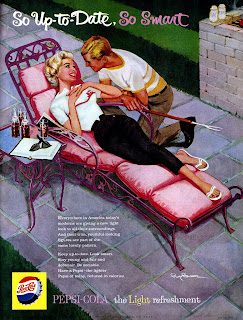
Part 1: The first advertisement sends the typical message to women: “use this product and you will be skinny and have a man.” We all know that this is not true especially with a high sugared product such as Pepsi. Pepsi, if not used in moderation for most people, causes weight gain and a serve out break of acne. I’m
not saying it’s a bad thing because our bodies are made the way they are supposed to be but the image contradicts itself. Also, the advertisement says that by drinking Pepsi the consumer will be “up to date and smart.” I have had a lot of soft drinks in my day, but none have made me any smarter or given any more knowledge of current events. Maybe if the cans came with articles out of the Wall Street Journal I could see where it could be true, but until then it is just false advertisement.
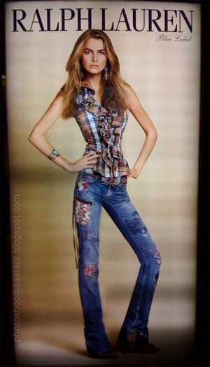
The only reason I even saw the second article was due to how little the model’s waist was. It did not make me want to buy her jeans, but instead give her a hotdog. This type of advertisement is the reason so many women and girls are developing eating disorders. There is no way in the world anybody could be that skinny and still be healthy. This picture gives off the impression of “Hey. Want to wear these cool clothes? Then you need to be as little as me.” I hate to break to Ralph Lauren, but if that is the only size they are selling, then they are about to lose a whole lot of business.
Advertisements like these paint such an unrealistic picture. The reason it is so hard to make it in the modeling world is because there are so few people that are actually like this. If advertisers put “real” women into their ads, I think it would help woman discover that they are beautiful just the way they are.
Part 2: This ad was put out by
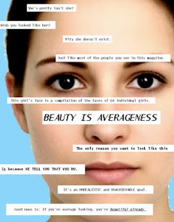
Seventeen magazine and I think they should be applauded for their efforts. They are showing that most people in there magazine are not real, and for young women to stop trying to be like them. What I do not understand is why put the models into the magazine? Instead of putting one ad in about how none of these women are real, why don’t they put a real woman in every ad? Either way, it is a small step into helping show women what true beauty really is and a small step is better than a step backwards.
Ads

 The first ad is for
belvidere vodka.It is degrading to women in a couple o f ways. Its insinuating to the audience that if you have a woman drink this vodka, something such as oral sex may occur.
The second ad is showing a man spanking his wife in a add for a certain coffee. It's related to a woman having an affair, and the many spanking her and punishing her for it. It's showing a mans dominance and somewhat of domestic violence, all over a coffee brand.


In theses two images
In the first advertisement, the woman is being told that by using Coppertone Suntan products while tanning, the product will make her look younger and prettier than she did the previous day before using it. It also boasts that it will have you looking like a Native American. The explicit message in this ad is that the woman on it is already young and supposedly “beautiful” but if they continue to use their product they will continue to look that way with healthier skin and a more desiring complexion. It’s obviously directed right towards Caucasian women. The implicit message is that not only will the complexion be looking Native American, but it will give the user a darker, not as pale look as they once had before. Also, in the bottom left corner, it is a smaller image of a little girl topless getting her swimsuit tugged on by a puppy. I guess that poses the idea that now that the little girl is all grown up and topless that men will start approaching her, especially with the help of her new tan.
In the second advertisement, a woman is pictured on the front of a magazine for International Lifestyle, with a dog on top of her licking her neck, while she is lying on a bed dressed in lingerie. Obviously this image screams “SEX”. The dog is portraying a man but in a dominating way because he is on top of her and she has her head turned. Because of the setting, it looks as if they would be people of the higher class who enjoy having a good time. The image seems to be sending out the message to “Live life on the wild side”. The woman is young with hardly any aging lines at all and is seen as the perfect super model.
Both of these advertisements reinforce the beauty myths that women should look young, thin, and attractive. In the first image the woman would look more desirable, healthier, and younger if she used Coppertone Suntan products. In the second image the woman is seen as living an upscale lifestyle enabling her to do wild and crazy things only if the man is present and going along with her

.
In society today we are constantly being told that beauty is a lighter skin toned woman who is thin and attractive. This advertisement displays women of different races and of different sizes advertising Bravissimo’s line of bras. The women look happy, healthy, and appreciative of their bodies even though all of them have large breasts. They are proud to show off what they have grown into and are embracing the fact that they are women. If I were to create an advertisement, I think I would use older women and men who look very natural. They would be happy to have aged and proud of who they’ve become through the years.
Friday, February 4, 2011
Advertisements


When flipping through a magazine or newspaper, or even driving down the street, people can learn a lot about societies views on gender are. An overwhelming amount of advertisements objectify women and exhibit male dominance. Although the media and advertising industry attempt to show society how men and women should be have some aren’t affected by it. Within these three specific advertisements there are several differ degrading issues that are references to women.
Over the years, women have been so consumed into what they look like. Being “skinny” is some people’s definition of beauty. Advertising agencies generally use young, white, skinny, and attractive girls to promote a product. By them doing this it makes it seem in order for you to be beautiful you must be skinny; however, very few women are this size. Over the past few years, plastic surgery increased, and eating disorders became more of a problem. In this particular advertisement, Ralph Lauren uses a very thin model to show the message of “skinny is beautiful.” The comparison of the two photos shown is very extreme. Although some women will look at this and strive to be this size, other women will be somewhat disgusted by how extremely thin she is. Focusing on the female physical appearance is what causes the amount of women with eating disorders to increase. Nearly one-tenth of young American women and one-fifth of female American students are on some form of a diet because they are trying to mimic the “beauty” image that advertisers are presenting to society.
Men are often seemed to be more dominant over women, and some advertisements portray to people the roles that gender play in society. It is rare that a woman is the dominating figure over the male in advertisements. In this specific advertisement, the male is positioned in front of the female and she is behind him. Also, it speaks on how women are supposed to be the “household providers” (such as the cook, cleaner, etc.).

While the previous advertisements bring into effect the myths of beauty and normative gender, this specific advertisement works against them. This advertisement shows that not everyone is so consumed in the “ideal” image of beauty. Also it shows that everyone is not extremely thin. The description on the side gives the advantages of having a big butt and how proud this individual is because of it. I would include this in my own advertisement to get the attention of a different audience and to show that it is ok to have curves and be confident with your body.
Advertisments


PART 1: The first ad I chose was the tailored suit ad, which was supposed to show the audience why they should buy a tailored suit. However, how they portrayed the ad was saying that men would get gorgeous girls falling all over them. The explicit message in this ad was that they picked a beautiful woman who had a low cut shirt on that would attract guy’s eyes while flipping through the magazine. The inexplicit message in this advertisement is not only that a man can get a woman while wearing a tailored suit, but a women’s vulnerability for a man. This ad reinforces the beauty myth that every girl should be thin and light skinned; this model obviously was both of these things. In this ad the male looks like he is the dominant figure just by comparing the two models outfits. The male looks like he is going to work, while she looks like she is just hanging around all day.
The second advertisement that I thought was appropriate for this blog was the one for post its. The ad shows a girl and a man the next morning after sleeping together the night before. The explicit message in this ad is that the man obviously sleeps with some many women that he had to write her name on a post it so he could remember the next morning. The inexplicit message in this ad shows how “easy” a woman can be, she doesn’t care that she is sleeping with a man who can’t remember her name. The beauty myth this ad reinforces again is the thought that women need to be thin with blonde hair. The male dominance is shown in this ad because it is assumed that the woman is the vulnerable one in the ad.

PART 2: After going through many Google pages, I finally found an advertisement that went against all the beauty myths. This Dove ad shows a older women who I proud to show off her body, even if it isn’t a perfect model size. Even though he is not clothed the purpose of the ad is to show women not to be insecure of their body. The message on the billboard “Does Beauty have an Age Limit?” it lets the public know beauty isn’t only defined by how young you look. If I was to make my own ad I would put a typical Latino mother, she would show the world that she can do whatever she wants no matter of her gender or size.
Advertisements
 The first advertisement I found was for a Detour protein bar. The picture on the left is a heavier woman holding a candy bar. The female on the right is a skinny beautiful woman holding a protein candy bar. The advertisement says "There's candy bars and there's PROTIEN candy bars". I think the implicit message in this advertisement is saying that if you eat candy bars you will look like the woman on the left or. Or if men eat candy bars they will have to date women that look like the one on the left. But if you eat the Detour Protein bar you will look like the woman on the right or for a man date women that look like her. This ad directly relates to the beauty myth readings by using a skinny, white, blonde woman that men desire to have and that women might desire to look like.
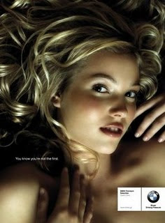
The next advertisement that I also thought related to what we are talking about in class is the BMW ad. This advertisement is promoting used automobiles. It says "You know you're not the first" and has a young looking girl who seems to be naked. The implicit message in this advertisement is that you know you aren't the first to "own" a used vehicle. By using this woman in the ad they are relating a used car to a used woman. They reinforce the man being dominant in a relationship by "owning" a used car, or this used woman.
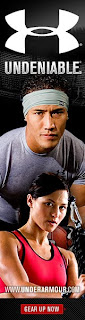
The Under Armour advertisement works against reinforcing dominant myths of beauty by having not only Asian Americans in the ad but also a man and a woman. They aren't really trying to target a certain gender or race they just want everyone to buy their product. These advertisements do not really bother me and it does not matter what gender or race the people are who are in the advertisements. I can see where some women would get offended by certain advertisements even though I don't. I think they did a good job with this advertisement because they are saying that anyone can buy their product and they aren't discriminating against a gender or race. If I was creating an advertisement I would use similar ideas like the Under Armour one.


The two images on the right that I found are very degrading to women. In the image in the middle, the advertisement is insinuating that all women are good for is sex. Also, it is sending out a negative message to women that if you have large breasts then people will look past your flaws. This makes women who do not have large breasts feel like they are not good enough or less of a woman. It makes women seem more like objects than a human being.
The image on the bottom is sexually degrading to women. Majority of people who see this advertisement, even pre-teens, know what this ad is trying to imitate oral sex. Again, this ad is making women seem more like sexual objects rather than people. It is also putting down women by making it look like the woman is about to perform oral sex on a sandwhich to apparently target male customers. This reinforces the idea that all women are good for is sex.
In almost all of the ads I found, including the two above, were white women. Even the ones from websites discussing negative advertisement of women were mainly caucasian women. This shows that other ethnicities do take a backseat when it comes to body dissatisfaction issues in the mainstream. Also, both women are obviously skinny and are made to look very sexually desirebale. This makes women connect being desirable only with skinny models and contributes to women having a negative self perception.
The image that I found on the top I believe is an advertisement that is working against dominant messages about normative gender and sexuality. There is barely any make-up on the woman's face and there is nothing sexually suggestive about this photo. "Beauty rooted in enviromentalism" is written at the top which is promoting beauty in the form of a quality in a woman not on their physical appearance.
If I were to make an advertisement to empower both men and women I would make sure that nothing sexual was implied. I would also try to keep a picture of either a man or woman out of the advertisement so there would be more focus on the product itself. However, if I did include a picture of a person I would make sure that majority of the focus in the ad was on the product rather than the person or people in it.
Beauty in Todays Society


Both of these advertisements are clearly depicting women in a light that is against everything we have been working for. In the first advertisement for Dole & Gabanna, the woman is clearly the target or prize. Surrounded by a group of men, the woman is alone and on the ground. The men are perched over her ready to pounce. Above all she is very slim and “beautiful”.
In the second advertisement, Kim Kardashian is posing for the Complex magazine cover. She is in a scandalous outfit in a womanly pose. In the first picture she is untouched. She has darker skin, heavier, and herself. The second picture is the one that made the magazine cover. She has lighter skin and is slimmer. They made her picture into what society reacts to as “beautiful” as someone people idolize.
In each of these advertisements, people see the pictures and automatically admire them. Consumers will see the pictures and automatically relate the product with something they need to look this way. This all goes back to beauty myths in today’s s ociety; these include skinny, fair skinned, and vulnerable. The males are dominant and the women please the physical aspect.
Beauty in today’s society is constantly backed up by the advertisements, models, and peers in magazines and TV. We hear that beautiful means being skinny, pale, and living up to a man's expectation. Without it, you will never get a husband, boyfriend, or be successful in the real world. Wrong. Dove came out with an advertisement a few years ago about loving your body. This is the first step towards a healthy society. These women are strong, beautiful, independent, and are proud of it. All women should follow their lead, embrace their body, and be healthy. In my advertisement I would feature real men and women who did not have to alter their bodies to reach their goals.
Women in Advertisements

It was not hard at all for me to find two advertisements that were exactly like the ones we discussed in class today. It wasn’t even necessary to scroll from page to page because I could have literally picked the first two and all I typed in the search engine was “women in advertisements.” However, it was interesting to me to see all the different types of pictures so, I looked through them until I found two that really made the ideas of dominance, sex and gender norms stand out most to me.
The first ad that stood out to me was an advertisement about voting. The first most obvious way that this add is degrading to women is the connection of the word choice on the advertisement “Voting is sexy” with the picture of toned, women’s legs in black, stiletto pumps. Clearly, the ad is using sex appeal to attract people to the idea of voting. They are demeaning a thing as important as voting by showing a stereotype of women who may choose to vote. This ad may invoke thoughts among women such as “If I don’t look like that, should I not vote?” Thoughts like these were demonstrated throughout all four readings; what we constantly see as beautiful is how we begin to actually think. Also, like we discussed in class, as if it’s not bad enough that they are making women into objects, it’s even worse that they are focusing on one part of that object which is exactly what they do in this ad; they focus in on the legs of a woman. Lastly, if we consider woman and voting in the past, we remember how long and hard feminists had to fight in order to earn women the right to vote. It is almost a slap in the face that they are now using the sexiness of women to draw appeal to voting when in the history, women were not even allowed near a voting poll.
In my second advertisement for Dolce and Gabbana, a woman is laid on her back and surrounded by three men. A fourth man is on top of her and is holding her down by her wrists as her legs are straddled around him. All of the men are above the woman; the three men standing up are literally looking down on her and she is lying on the ground making eye contact with none of the men. The background consists of a blue sky with clouds; it is a subtle way of sayi

ng “it’s a beautiful day and everything is okay.” This ad is supposed to be promoting a top of the line designer but instead all I can see is male dominance over a female and the idea of sex is being promoted more than the designer. The feeling that the ad gave off to me was very uncomfortable, not just because of this one ad, but because it made me realize how many ads are like this. Every time I flip through a magazine and ignore the messages that these ads are creating, the more I am conforming to these inaccurate views of our society.
This advertisement was very refreshing to  see after looking through the pages and pages of degrading ads prior to this. It did not come easily to me, however. This ad took much more time because as I looked at all the ads that google pulled up, I realized that most ads are like the previous ones. This ad is for Microsoft Office and it has a normal looking mother pictured. It says that she is a “mother on a mission.” This ad portrays this woman as a successful, confident and goal driven woman who won’t stop until she has the tools she needs to complete whatever her mission may be. It does not give any insinuations as to what her “mission” is. It gives no indications that her “mission” has anything to do with being a female. If I made an advertisement, I would simply advertise what the product was and what it is going to do. That is all an ad should be anyway, something that is equally useful and directed at all people, no matter what their race or gender.
Subscribe to:
Posts (Atom)